Clarity University: Logo Design, Identity Development, product development
Jayne Agency launched a new subset company, called Clarity University (CU). As lead designer on this project, I was tasked with designing a logo and look & feel for CU. In addition, I designed the workbook product that CU sells to instruct business owners on the basics of brand strategy. The challenges: maintaining a cohesive relationship with the parent brand while ensuring distinct individuality, and incorporating an element that acknowledged the brand was still in the development phase.
Drawing inspiration from the established identity of Jayne Agency, I infused elements that echoed its core values (smartly strategic, wickedly creative, response-driven) while also conveying CU’s tones and personality: Relevant, Empowering, Analytical, and Unleashing. The final design blends a hearty slab font with the refined Jayne Agency san serif, resulting in a mark that is reminiscent of a collegiate logo.
Beyond logo design, my involvement extended to the strategic development of the business itself as well as product development and design. I actively participated in brainstorming sessions aimed at fostering growth and scalability, contributing insights and ideas to shape the trajectory of the business. I was the lead designer in charge of designing the CU workbook, a 70 page guided tool used to educate business owners on brand strategy. Additionally, I played a pivotal role in defining the brand's language and messaging, ensuring consistency and resonance across all public-facing communications.

Clarity University Beta logo

Business Cards

Clarity University + Jayne New Years Card

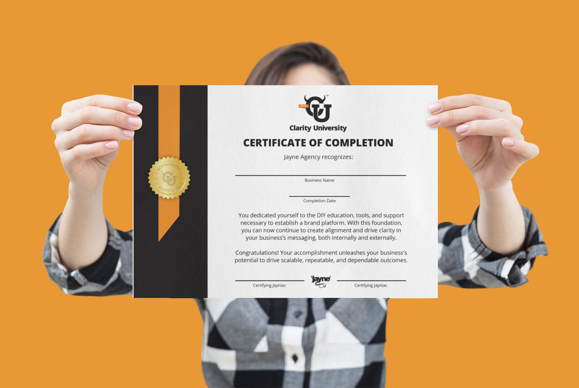
Clarity University Certificate of Completion

Clarity University Linked in Banner

