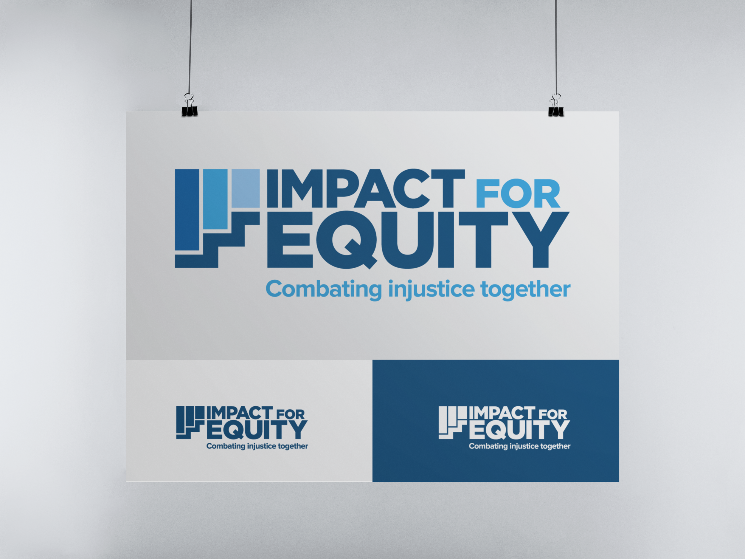
Impact for Equity - Logo Design and Rebrand
The redesigned logo, reminiscent of the visual depiction of 'equity,' embodies the notion of fairness, progression, and community. The rectangles are symbolic of people, while the staircase demonstrates the notion of allocating resources based on individual needs as well as indicating forward progress. The blue hues pay homage to the former brand while the bold typography emphasizes the importance of the organization’s mission. The reception from the board was overwhelmingly positive, a testament to the effectiveness of the methodology and design choices.
This project is highly significant to me as an individual as I am passionate about the mission of the organization and am honored to be a part of this rebrand.


